At Netlify, the core frontend team aligns on the importance of making our interface accessible for all our users.
Within the team, every single developer is responsible for implementing and testing the accessibility of the features they are working on.
Companies building products or services often need to focus on rapid development; however, at Netlify, we strongly believe that this is not incompatible with an accessible product.
This blog post explains how we pay particular attention to accessibility when building our product, making safeguarding accessibility part of our process, for the sake of all our customers.
Accessibility as an acceptance criteria
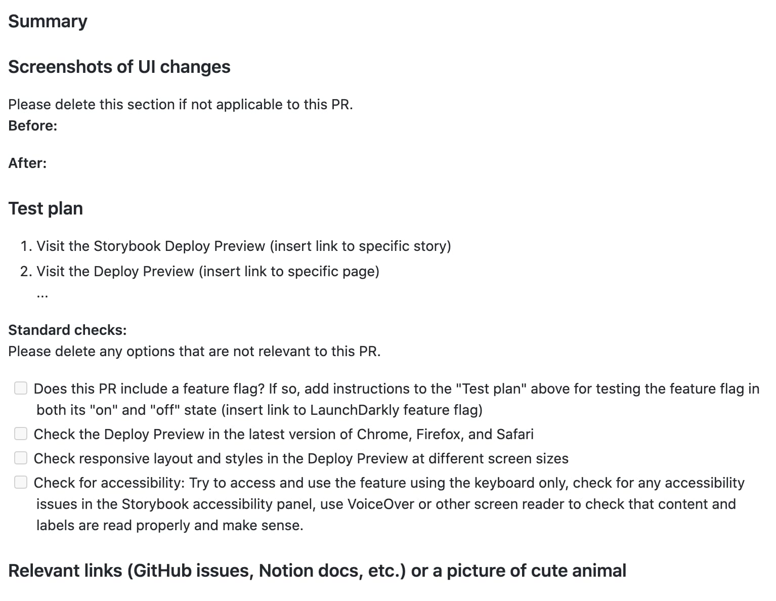
Pull requests are an important part of our development workflow. When we open pull requests (PR) for review, we use a specific PR template to help reviewers have more context about the work done, and guide them into how to review and test that the code works correctly.
Here’s our standard template:

We start by asking for a summary of the work done in the PR, to help reviewers quickly get an understanding of its purpose. Then, if this work includes a visual change, we ask for a before/after screenshot (or only the after) to help the reviewer have a better idea of where they should focus in the UI when they check the changes in the deploy preview.
Then, we have a test plan section, where the developer can write different steps the reviewer should follow to make sure things are working fine.
Finally, the “standard checks” is dedicated to the steps that should be more generally taken when reviewing PRs as part of our standard process, including:
- Testing the different feature flag states (if there are any)
- Check for cross-browser compatibility
- Check the responsiveness
- Ensure the change made is accessible
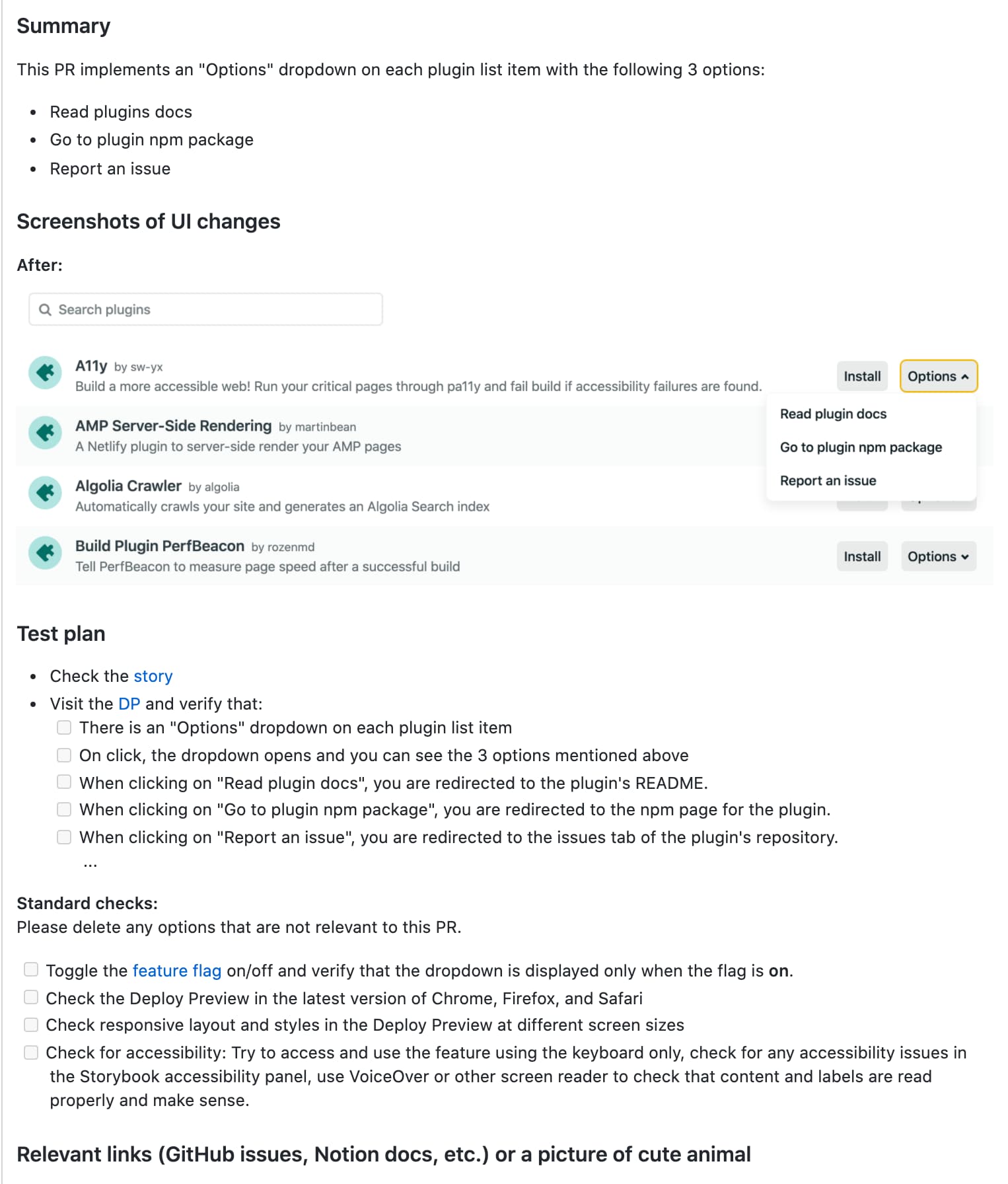
An example of this PR template filled could look like this:

In the screenshot above, when we say “Check for accessibility”, we include some notes to call out some specific checks to do:
- Use a keyboard-only approach to navigate the feature or access it.
- Check the Storybook accessibility panel to see if there are any accessibility violations.
- Navigate the feature using VoiceOver or another screen reader to see if the information makes sense and if labels are read properly.
Different parts of a user interface, and the differently designed interactions, will not have the same needs when it comes to accessibility testing. Therefore, the testing we do depends on the work we submitted a PR for.
If the change was related to a color, we might only check the Storybook accessibility panel if there is any color contrast violation. If the change was related to adding a new card in the site’s settings section, our accessibility testing will involve keyboard navigation and testing with VoiceOver.
We trust and expect both the developer who built the feature and the one who is reviewing it to test for this.
When using VoiceOver, we are aware that we probably are not using it exactly the same way as a regular screen-reader user, however, we are still able to catch issues such as missing labels for example.
Tooling
As mentioned in the previous section, we use the storybook-addon-a11y package to display accessibility violations. Alternatively, you can check out netlify-plugin-a11y.
As we already use Storybook extensively to check our components when reviewing a PR, this add-on gives us the opportunity to easily integrate accessibility checks as part of our workflow, which allows us to catch potential issues early.
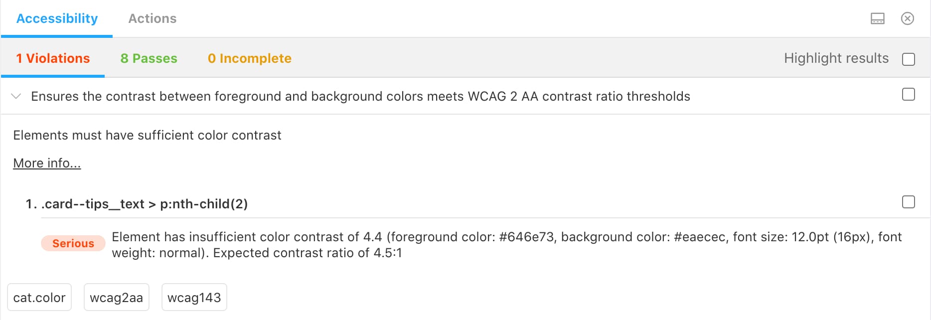
Here’s an example of a color contrast violation in one of our components:

If this violation is related to the current work done in the PR, the developer should fix it before merging the work. If it is unrelated or if it requires a bigger change (e.g. it means the color palette needs to be updated), the developer usually creates an issue to address it separately.
More recently, we also decided to add the @axe-core/react package to get warnings in the developer tools.
As Storybook displays your components independently, it may miss accessibility issues introduced in layouts when multiple components are put together, so this package intends to catch these.
Here’s an example of what is displayed in the browser’s console, when this package finds issues:

The potential problem with this tool however, is that it flags all accessibility issues in a page and not necessarily the ones associated with your current work. As a result, to avoid creating additional noise and confusion, we’ve decided to use this tool to do an accessibility audit across all pages, capture the violations found in GitHub issues to make sure they get worked on, and then remove it.
This process can be repeated a few times a year to ensure regular audits.
Additionally, we also use the jsx-a11y eslint plugin, a static analysis tool, to check for accessibility rules on JSX elements as we’re developing.
Prioritisation
Finally, and importantly, we label our accessibility issues as “bugs”.
When we create issues in our repository, we tag them with one of the following 3 labels:
- Feature
- Chore
- Bug
The feature label is pretty self-explanatory, we use it when the work done is mostly related to adding something to the Netlify product.
The chore label is used for issues around refactoring, adding some new tooling, upgrading a package, etc.
The bug label is used when something is not working as expected, and this is why it also includes accessibility issues.
For example, if a button cannot be accessed with the keyboard, it’s not usable, no matter if it is only for a subset of users. If a user using a mouse cannot click or see a button, we would definitely consider this a bug in the UI, so we approach keyboard accessibility the same way, as the impact of the issue is the same, only on different users.
Labelling our accessibility issues as “bugs” is also a way for us to make sure they are prioritized. If any of our developers has some extra time or is on-call, working on bugs is usually something we should do first.
This is just a glimpse into our efforts towards making Netlify increasingly inclusive and accessible, but we’re always working to improve our processes and work further.
Of course, this does not mean that we get everything right and that there is no accessibility issue within the Netlify product. There are always things we might miss, things that were introduced a while ago, and things that require a bigger refactor and hence, more time. However, by making it part of our workflow, we give ourselves the opportunity to catch issues early and make sure we build a better and more accessible product for all our users.
How do you work to make your sites and applications accessible? Tell us on twitter.com/netlify or over in our community.


