When production goes down, everything stops. It’s a scramble to try and correlate request logs, deploy histories, and recent application updates to piece together what happened. Most third-party monitoring tools treat this data as generic logs because they lack the surrounding platform context that helps explain why behavior has changed. That context is critical for diagnosing issues when addressing a problem in production.
Netlify Observability gives you real-time visibility into traffic, function performance, and cache behavior with zero instrumentation required. And because there’s no volume-based billing, you get predictable costs without worrying about usage spikes. For teams coming from event-based logging tools or platforms like Vercel, that difference can save tens of thousands per year.
This guide is for engineering managers who need visibility into traffic patterns, function performance, and user behavior. The focus is making Netlify’s built-in telemetry part of daily operations. If you’re preparing for a launch and need a structured set of checks before go-live, see the Production Launch Checklist that pairs well with this guide.
Establish your rhythm
Teams get the most value from Observability when it’s treated as part of the normal operating rhythm. Consider making the following patterns part of your QA process.
Daily checks
Scan traffic, latency percentiles, and error rates. Look for unexpected changes in request volume or p95/p99 behavior. This gives early warning before user issues surface.
Per-deploy reviews
After each production deploy, confirm that error rates and latency remain stable. Use grouping (URL, function) and request details to verify that the deploy didn’t introduce regressions. This process typically takes a few minutes, eliminating the manual effort and uncertainty associated with reviewing logs.
Weekly or monthly drift reviews
Use longer windows to spot gradual changes: latency creep, payload growth, cache efficiency shifts, and functions that are slowly getting slower. These patterns are hard to see in short time slices and often map to accumulating technical debt.
This rhythm gives operators a predictable cadence. The sections that follow show where each of these signals appears in the UI and how to use them during deploy validation, performance tuning, and incident response.
Observability in Netlify
The interface organizes around a few core concepts: time-series charts at the top, a filterable request table below, and detailed request inspection in a slide-out panel.
Traffic charts The top of the page displays request volume, latency percentiles (p50, p75, p90, p99), and response size over time. Use the Sum by control to toggle between views:
- Status class: See the breakdown of 2xx, 3xx, 4xx, 5xx responses
- Bandwidth: Track data transfer patterns
- Duration: Monitor latency distribution
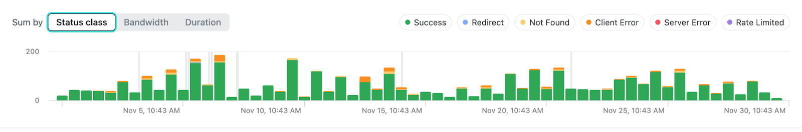
When something drifts—such as p99 latency climbing from 800ms to 3s over a week—these charts surface the trend before users complain.
Request table
Below the charts, every request appears with timestamp, status, method, path, primitives (function/edge indicators), and duration. The header shows total requests and current error rate for the selected window.
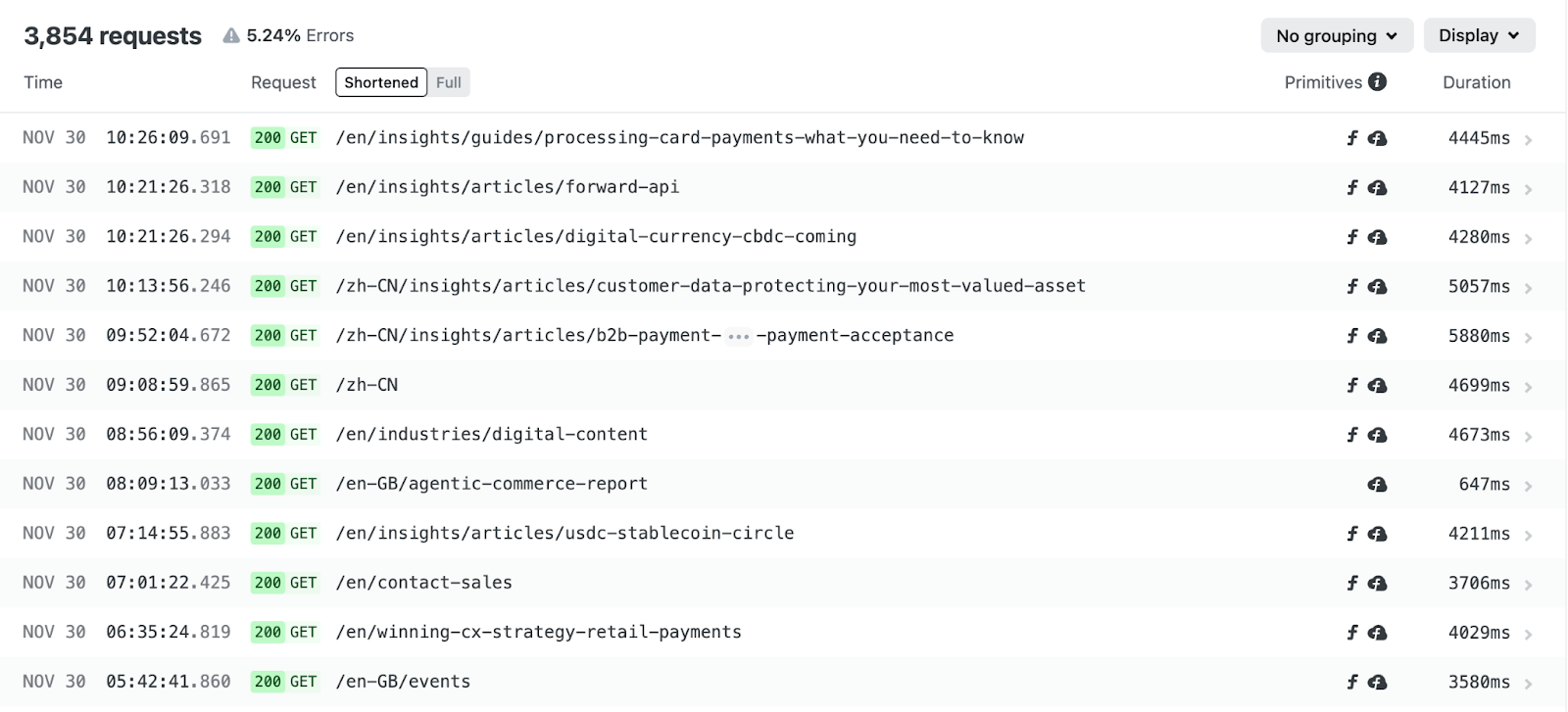
When a request reaches Netlify, it moves through a predictable chain of platform services: global traffic routing, firewall and protection layers, edge logic, caching, and finally your functions or origin. Each of these stages leaves behind signals that Observability captures such as whether a function ran, whether the response was served from cache, or whether edge logic was invoked. Understanding this flow helps you read the request table with clarity because the primitives shown there reflect exactly where in the chain work was performed.
Grouping options matter here. Group by URL to spot endpoints with degraded performance. Group by function to isolate which serverless code is contributing to latency. Group by user agent to distinguish different types of clients that are connecting to your application.
One thing that catches teams off guard the first time they review these results is the sheer volume of bot traffic. Group by user agent category and you’ll likely discover that a significant portion of your traffic isn’t human. For some sites, bots account for 40-60% of requests. Knowing this changes how you interpret traffic spikes and capacity planning. It also explains why your function invocation counts might be higher than expected.
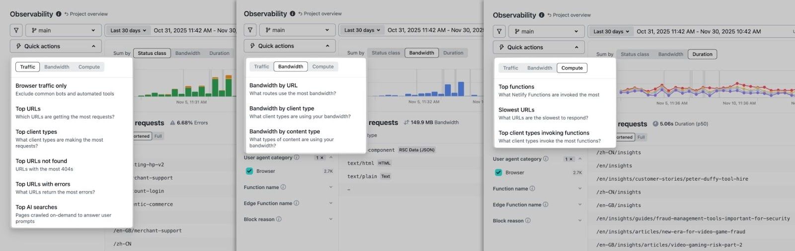
Quick actions
This menu surfaces common queries without manual filter configuration:
- Traffic: Top URLs with errors, Top AI searches, URLs with most 404s, etc.
- Bandwidth: Bandwidth consumption by URL, by content type, etc.
- Compute: Top functions, Slowest URLs, etc.
Request details
Click any row to see a full unified view of a request. Here you can see all associated logs including serverless functions and edge functions, including the following details…
- Full URL, method, status code, timestamp
- Duration breakdown by pipeline stage (edge middleware, function execution, origin)
- Response size and content type
- Cache status (hit, miss, stale-while-revalidate)
- Client IP, geolocation, user agent
- Console output from functions or Edge Functions
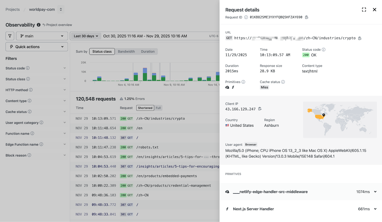
This view is used to confirm hypotheses. If a function is slow, the timing breakdown shows exactly how much of the request it consumed.
Filtering and search
Refine by time range, branch, HTTP method, status code, content type, cache status, user agent category, or function name. Full-text search covers URL, user agent, and client IP.
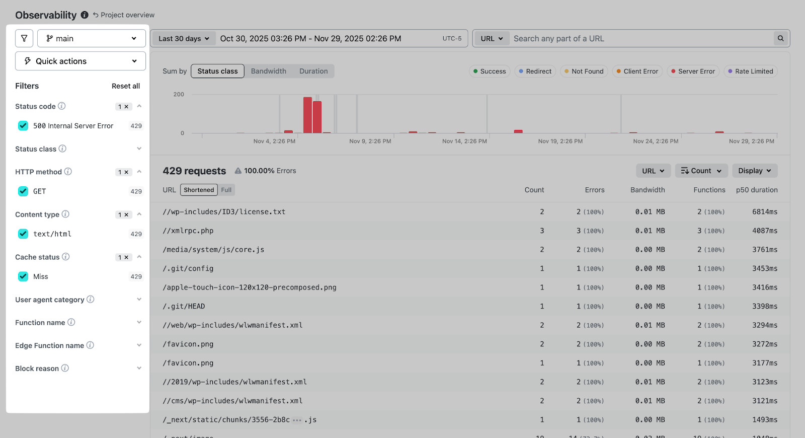
The branch filter deserves specific mention: you can isolate traffic to a deploy preview or staging branch without the noise of production requests.
The UI is structured intuitively so high-level indicators provide context, and the request details supply evidence needed to understand what is happening at any moment in time. With these features combined, teams get immediate access to run-time level insights that can help triage any issue across every environment.
Validating deploys
New deploys are the most common source of unexpected behavior.
Here’s a practical workflow:
- Narrow the time window. Use the time-range filter to bracket 30 minutes before and after the deploy. This isolates the transition.
- Compare status class distribution. If 5xx errors jump from 0.5% to 3% immediately post-deploy, you have a regression.
- Check the Duration chart. Watch for p90/p99 latency spikes. A function that was running at 400ms and now takes 2s will show up here.
- Group by URL. See which endpoints changed in size or performance. A route that suddenly returns 2MB responses instead of 200KB indicates a build issue or data problem.
- Group by function. If a specific function started throwing errors or slowed down, this surfaces it immediately.
- Spot-check individual requests. Open a few requests to the affected routes. Check the timing breakdown and any console output.
This workflow takes 5-10 minutes and provides confidence that a deploy is functioning as expected, or clear evidence of what broke.
Incident response and debugging
During an outage, the first question is scope: is this one endpoint or the whole site?
Assess Scope
Start with the status class chart. A spike in 5xx across all routes suggests a platform or configuration issue. A spike concentrated on specific URLs points to application code or a downstream dependency.
Zoom to the Incident Window
Easily zoom in and see the overall traffic degradation. Click and highlight to zoom into the specified area, then instantly filter requests made in that range for fast triaging.
Filter and Group
With the window narrowed:
- Filter by status code (e.g., 500, 502, 504) to see only failures
- Group by URL to find which routes are affected
- Group by function to check if serverless code is the culprit
- Filter by branch if you suspect a specific deploy
Examine Representative Failures
Open 3-5 failed requests. Look for patterns:
- Are they all hitting the same function?
- Do the console logs show a specific error?
- Is there a timeout occurring at a consistent pipeline stage?
- Are they all from the same geographic region?
Example Investigation
You see a 5xx spike starting at 09:15. Zooming in, you notice errors cluster on /api/checkout. Filtering to that path and grouping by function shows checkout-handler with 100% error rate. Opening a request reveals the function timing out after 10s with a console log: Error: ECONNREFUSED connecting to payment-service.internal.
Root cause: downstream payment service is unreachable. The investigation took 3 minutes.
Once you’ve identified the problem, the next question is how fast you can ship a fix. If the root cause is in your code thanks to a misconfigured environment variable, a broken API call, a missing null check, consider using Agent Runners to draft and deploy a patch without ever leaving the Netlify ecosystem.
Performance tuning and optimization
Beyond incident response, Observability can reveal performance drift over longer periods.
Weekly/Monthly Reviews
The 7-day and 30-day views surface trends invisible in shorter windows:
- Gradual latency creep. p90 moving from 500ms to 900ms over three weeks often indicates accumulating technical debt—larger payloads, additional database queries, or degraded third-party APIs.
- Payload bloat. Response sizes growing steadily might mean unoptimized images, verbose JSON responses, or assets that should be code-split.
- Cache efficiency decay. Hit rates dropping from 85% to 60% suggests cache headers changed, content became more dynamic, or TTLs are misconfigured.
Bandwidth Analysis. Use the Bandwidth tab in Quick Actions to identify:
- Which URLs consume the most data?
- Which content types dominate bandwidth? (images? JSON? video?)
- Whether specific functions return unexpectedly large responses
A function returning 5MB JSON responses when it should return 50KB is a problem worth catching before it affects your bill or your users’ load times.
Cache Behavior
Cache status appears in every request detail. Watch for:
- High miss rates on content that should be cached
- Excessive revalidations suggesting overly aggressive cache invalidation
- SWR (stale-while-revalidate) patterns not behaving as expected
Function and Edge Function logs
Console output from functions appears directly in the request detail panel. No need to switch to a separate logging tool.
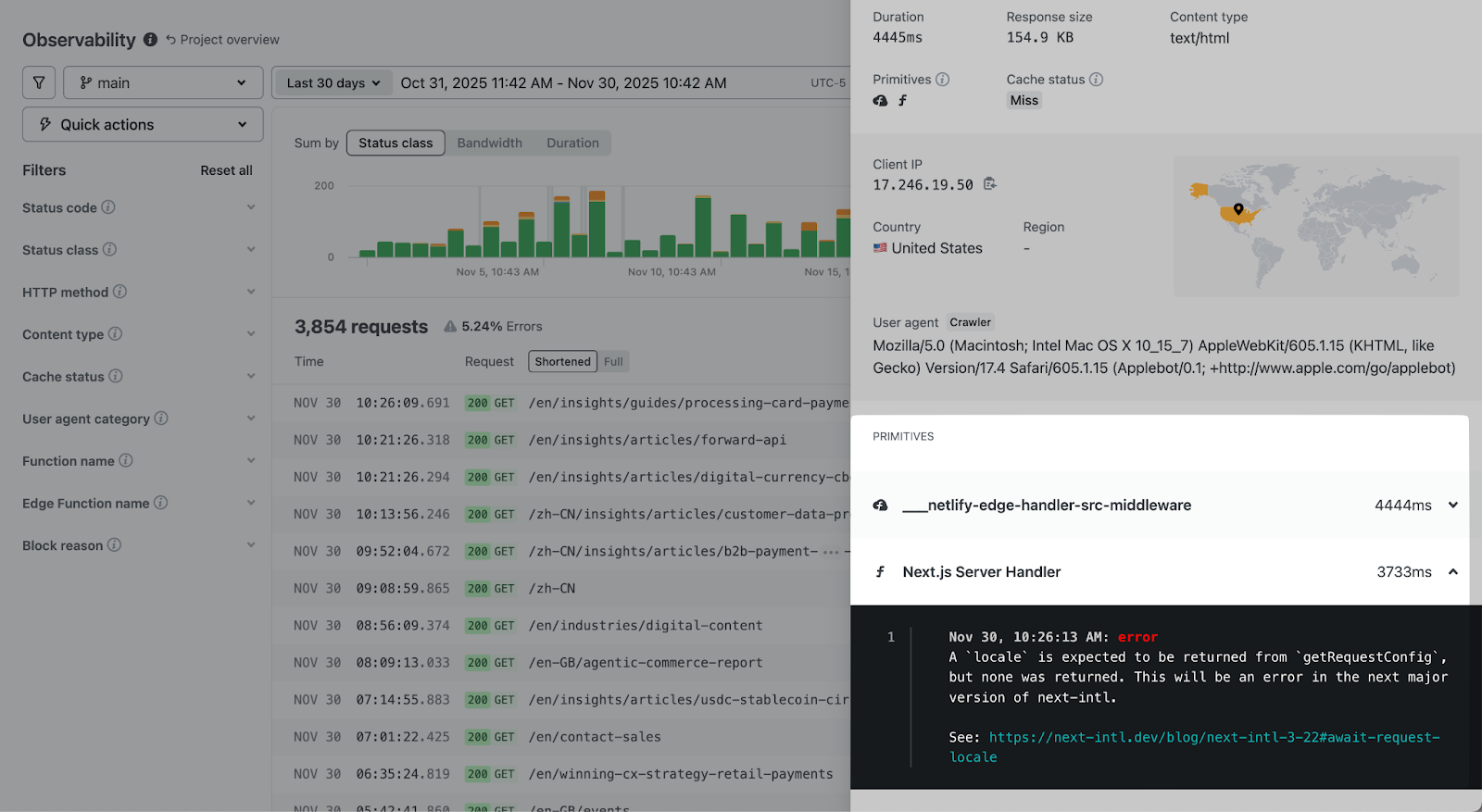
This integration matters because you can see the log in context: you know the exact request that triggered it, the timing, the client details, and the response status. Correlating logs to requests is automatic.
For debugging, filter to requests that invoked a specific function, then scan the console output for errors or unexpected values.
When to use external tools
Most teams won’t need anything beyond Observability for day-to-day work. The real question is whether your situation falls outside “day-to-day.”
Observability alone works well when:
- Your debugging stays within Netlify (deploys, functions, edge logic, caching)
- You’re investigating a single site or a handful of related sites
- Retention requirements fit within the available window (1 day on Free, 7 days on Pro, 30 days on Enterprise)
- Your alerting needs are basic or handled elsewhere
External tools show their value when:
- You’re correlating Netlify traffic with other services, databases, or APIs
- You manage dozens of sites and need a unified view across all of them
- Compliance requires storing logs for months or years
- You want custom alerting thresholds that trigger PagerDuty, Slack, or other incident workflows
Enterprise teams can configure Log Drains to send request data to Datadog, New Relic, Splunk, or a custom HTTP endpoint. The data flows continuously, so your external dashboards stay current.
For real-time operational work like validating a deploy or investigating an incident, Observability remains the fastest path to answers. You’re looking at the data where it originated, with full context about deploys, branches, and platform behavior. While external platforms aggregate broad infra health, Netlify Observability lets you validate deploys and debug active incidents to get your team back on the production path.
Conclusion
Keeping services online is easier when the most important signals live in one place. With Netlify Observability, you get direct access to request activity, function behavior, and performance trends without extra setup or separate tools. It provides the context needed to make informed decisions about your application.
The workflow outlined above is consistent regardless of the situation:
- Start with the traffic charts to understand the broad pattern
- Narrow the time window to the relevant period
- Filter and group to isolate the affected requests
- Examine individual requests for root cause
The interface is designed to move you from “something seems wrong” to “here’s exactly what happened” as quickly as possible. This pattern helps teams move with confidence during both planned and unplanned events.
Try Observability by opening your project and run the deploy validation workflow against your most recent production deploy. You’ll know in minutes whether your baseline is healthy.