Allow me to kick off this Design Series with our grid system — the building blocks. This is the scale that will be used to make a lot of layout decisions, keep a coherent look throughout the app, and make implementation more simple.
I started with the simplest thing, the unit, and for that I followed the rules of the 8-Point Grid.
Here’s the basic principle, from the Spec FM folks:
Use multiples of 8 to define dimensions, padding, and margin of both block and inline elements.
I didn’t stop there.
For proportions I decided to go with the Golden Ratio (1.618) model and define the standard sizes for all our elements when possible. This means that I take that proportion and round it up to the nearest multiple of 8.
This is what it looks like:
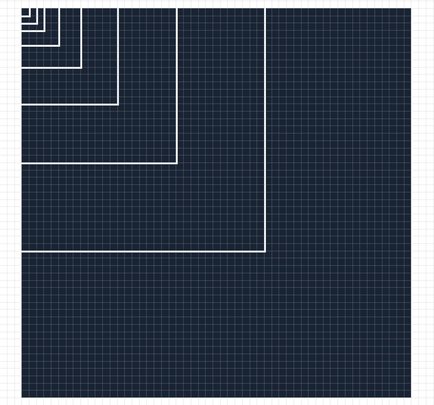
In practice, for every element you should give it a margin of either 8/16/24/40/64/… for example.
This gives the app a consistent look and feel, and makes it easier to add new elements and components. By adding these dimensions to our app as variables, we can make sure that everything stays proportionally sane across elements. It also makes it easier to communicate and translate static mockups to code, since it’s pretty easy to identify just by looking at a PNG, if something falls in the 8pt, or 16pt, etc…
/* Dimensions */--micro: 8px;--tiny: 16px;--small: 24px;--medium: 40px;--large: 64px;--xl: 104px;--xxl: 168px;--3xl: 264px;--4xl: 424px;--5xl: 680px;--6xl: 1088px;Simplify your design work
Setting up these constraints was actually liberating and made my life as a designer more simple. However, in order for this to work, you have to trust the system.
Trust the system and you’ll stop fighting the limitations. See them as a fabric of logic and structure throughout your work. Trust the process.
After the whole team was on board with the basic grid, it was time to start mocking things up.
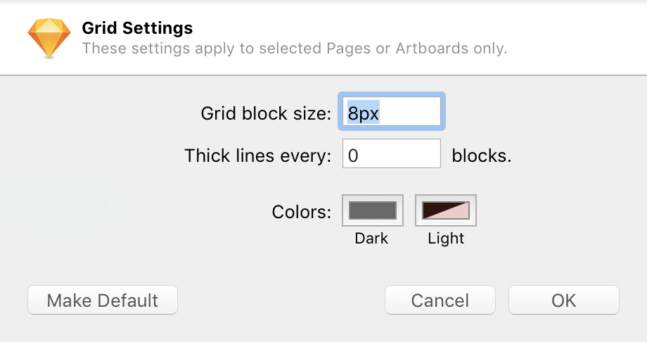
We currently use Sketch as our main design tool, so the first thing I did was translating this grid to it. Pretty simple thing to do, just navigate to View → Canvas → Grid settings… and set up your Grid block size as 8px. I personally like to remove the thick lines at every X and change the color of the grid — but that’s just me.
Another useful app that you can install is Nudge.it.
Nudge.it allows you to change the value of the big nudge (hitting CMD + Arrow Key on your keyboard) from 10 points, to any value that you want — in this case, 8 points!
With that, you’re pretty much all set.

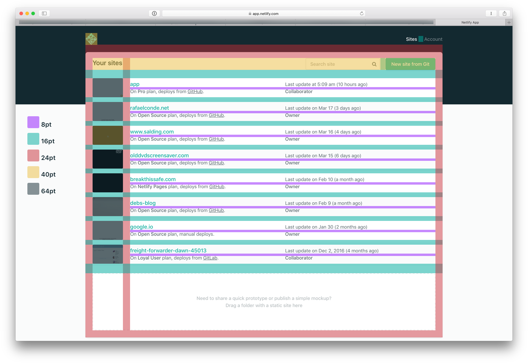
Here’s an example of our Sites page with these dimensions highlighted.
We will be sharing a lot more about the process in future installments, like Designing in components, so keep an eye out here on the blog or follow us on Twitter for all the updates.