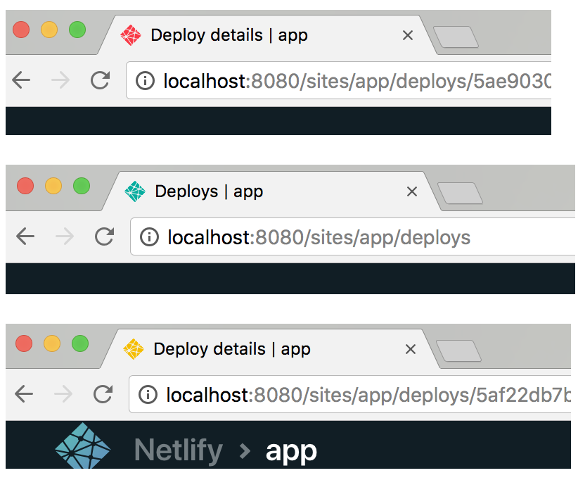
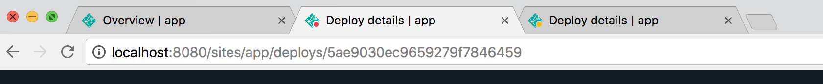
Ever tab away from a Netlify deploy log only to lose it next to a sea of similar looking Netlify tabs? Yeah, that happens to us, too. That’s why we recently rolled out an update that displays deploy status information in the favicon on your browser tab. The special favicons appear when you navigate to your deploy logs.
Here’s what you’ll see:
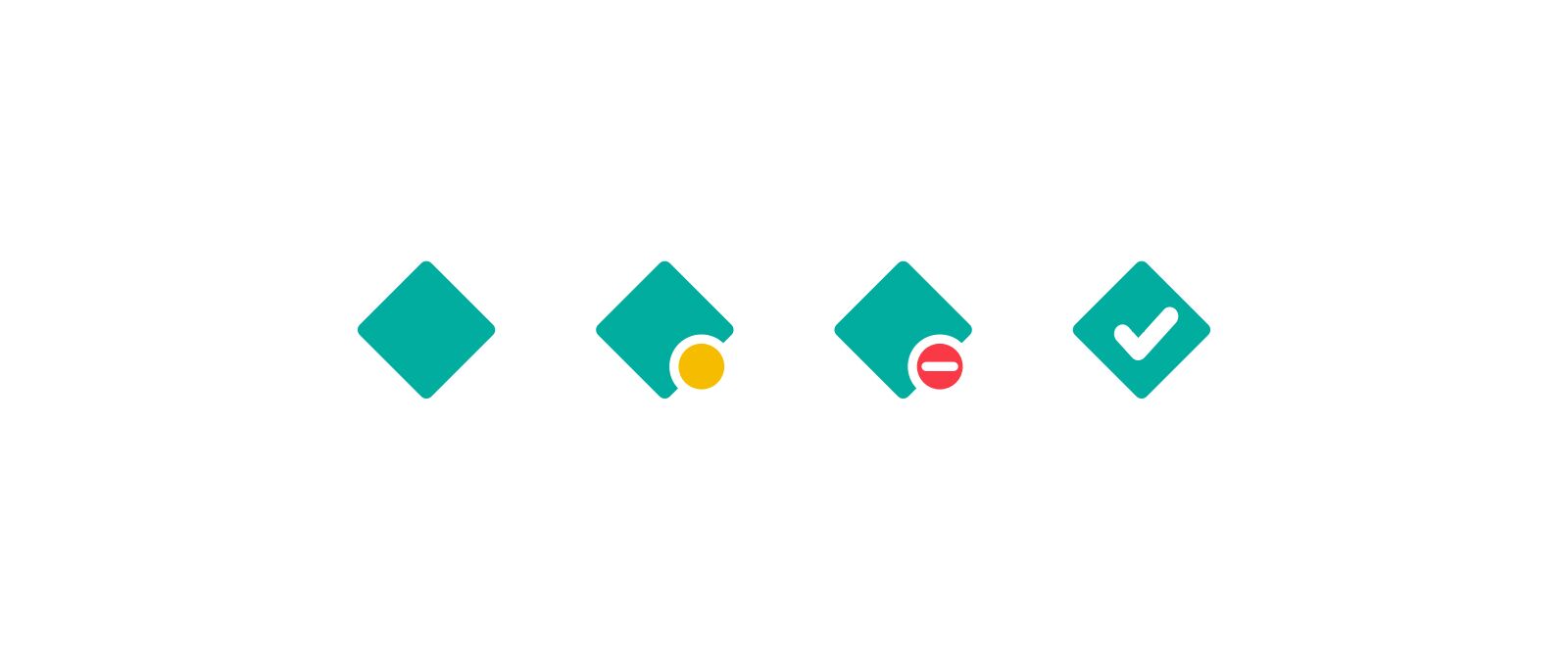
You will see a yellow dot on the icon when the deploy is building; it will turn into a white check on the logo if the build succeeds, or a red dot with with a line through it if the build fails. When you are on a different page of the app, no status icon will be shown.
While this might seem like a simple feature, we discovered a few interesting problems during development. Keep reading if you’re curious how we worked through these problems.
Brand sentiment
In one of our first iterations, we used red, yellow and green colorized versions of Netlify’s logo. We decided against this initial version to avoid developing unintended user sentiment during negative outcomes like when your build fails.
Shape and contrast
In an attempt to solve the problems we identified with a colorized logo, we switched to using small colorized dots overlaid on an unmodified logo.
The colorized indicator overlay solved some of the problems we had with the colorized logos, but a large issue remained. Color blind and vision impaired individuals may have trouble distinguishing the red, yellow and green colors of the dots if they lack any distinguishing features independent of color.
When working with a fraction of 16x16 and 32x32 pixel icons, it may seem like it’s hardly worth including distinct status shapes, but it actually provides important distinguishing features to anyone who can’t easily distinguish colors.
First, we removed a lot of the “noise” from our logo by reducing it to its simplest shape. This helped ensure it looked sharp as a small 16x16 pixel icon and afforded visual room for the increased detail around the status icon.
Then, we had to come up with different shapes to distinguish between the building and failed states. We tried a lot of them, and these were some of our favorites:
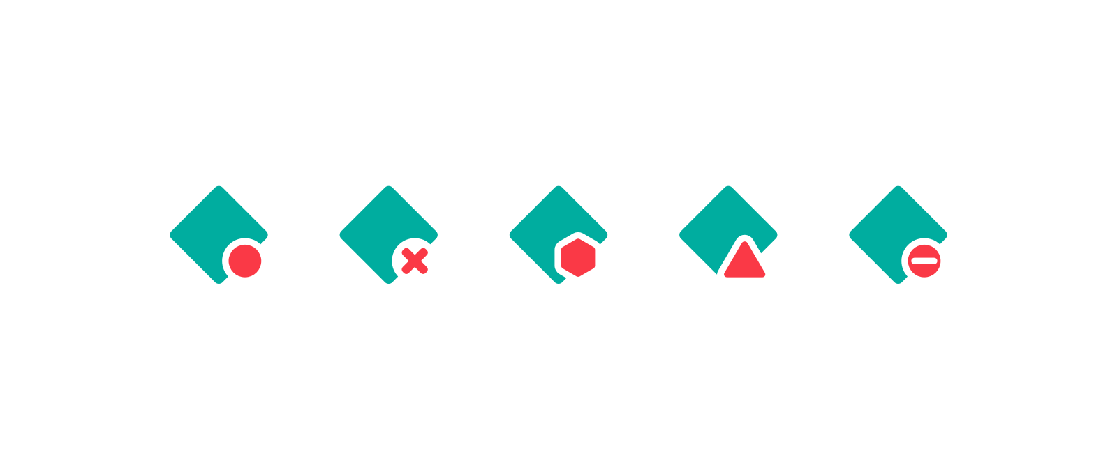
As we explored each shape, we had some realizations:
- We couldn’t use the circle because we couldn’t rely on color alone to differentiate the icons.
- The x at 16x16 is too blurry and hard to understand.
- The stop sign at lower resolutions looks too much like a circle.
- We use triangle shapes across the app to indicate a warning status, and not errors, so that could be confusing.
- There is no standard mapping between stoplight colors and shapes. (but maybe there should be?)
Final
Ultimately, we chose a set of favicons that incorporated considerations for color, shape, and contrast.
Conclusion
Hopefully this feature comes in handy and isn’t too disruptive to your compile time sword fighting.

I bet xkcd didn’t anticipate these status favicons
We strive to take accessibility into consideration when designing and changing features, and make a best-effort attempt to not let easy-to-miss accessibility issues fall by the wayside. If any of these accessibility design considerations have made your work a little easier we would love to hear from you! Likewise, if we’ve missed something here or elsewhere in the product we would love for you to help us learn and get better.
Lastly, if you enjoy solving problems like this, we’re hiring!