The React codebase that powers app.netlify.com is about five years old. During these five years, the focus has mostly been on high-speed growth, as most start-ups do. For this reason, what started with organised PostCSS gradually grew to become a complex and entangled global CSS architecture with a lot of specificity and overrides. As you might expect, there’s a point where the added tech debt it introduces makes it difficult to keep shipping fast without adding any regressions. Besides, as the number of frontend developers contributing to the codebase also grows, this kind of CSS architecture becomes even more difficult to work with.
For this reason, in 2021, we are taking on the challenge of refactoring the entire Netlify UI codebase to utility CSS, using Tailwind.
This blog post is the first of a series that will cover our decisions, implementation strategy, technical difficulties, and things we learn along the way.
Initial state of the codebase
Currently, our codebase contains about 35 different CSS files. Some of them contain the styles dedicated to parts of the UI (e.g. navigation.css), others seem to be dedicated to particular components (e.g. Banner.css) and others to more general elements (e.g. animation.css, images.css).
Maybe this would be ok if styles were truly encapsulated, but it’s very difficult to keep things separated when using global CSS. Hence, the CSS file that is supposed to be dedicated to the alerts components also has styles for buttons and links within these alerts, and the CSS file dedicated to the settings components also has styles related to our cards components… you get the idea.
Why is this a problem? Because as the company, team and codebase grows, it’s very difficult to know where things are, what classes should be used where, and people end up writing overrides over overrides, hacking CSS until it works. In the long run, this creates a real blocker to being able to ship fast and with confidence.
We started conversations about refactoring our CSS last year and spent a lot of time brainstorming different CSS frameworks to find the one that would match what we were looking for the most.
Benchmark of different CSS solutions
To find the best solution to our problem, we first had to define what we actually wanted out of the tool. We were looking for something that could fit most of the following criteria:
- Human readable
- Low specificity by default
- Handles variations
- Modular/Composable
- Performant
- Doesn’t make naming hard
- Allows safe refactoring
- Extensible
- Does not enforce bad markup patterns
- Positive impact on developer velocity/productivity
- Reasonable learning curve
We compared these criteria to the following CSS methodologies: BEM (OOCSS), CSS modules, CSS-in-JS, and utility-first CSS with Tailwind.
Without going through our benchmark of all these tools, we ended up deciding on Tailwind for the following reasons:
✅ Human readable: Tailwind classes are pretty self-explanatory. For example, text-black sets the color of the text… to black. 🎉
✅ Low specificity by default: Utility CSS encourages a single class per style with a consistent, low specificity score.
✅ Handles variations: We can use component props to enforce consistent styling, like an <Alert> component that has variants for error, warning, and success states.
✅ Modular/Composable: Tailwind makes CSS styling really modular as each class does exactly one thing.
✅ Performant: Utility CSS removes the need to continually add more CSS to your bundle as your featureset and patterns grow. Tailwind also has PurgeCSS built in, making it easy to shed unused utilities and shrink file size in production.
✅ Doesn’t make naming hard: With Tailwind, naming is unnecessary!
✅ Allows safe refactoring: We don’t know if refactoring CSS ever feels “safe,” but using Tailwind means that styles become completely encapsulated to the element the style is applied to, so there is less fear of introducing regressions somewhere else in the codebase.
✅ Extensible: Configuring Tailwind to match custom design tokens is easy, and once set up, helps enforce visual consistency (no more one-off hex values or “magic numbers”!). Writing custom plugins can extend functionality even further.
✅ Does not enforce bad markup patterns: Utility classes can be applied to any element as needed! No more using <h2> where an <h3> is more semantically appropriate just to get those sweet <h2> styles.
✅ Impact on developer velocity/productivity: There might be a small impact at first while people learn how to use Tailwind, but once people are used to how the classes work, styling components becomes much faster!
✅ Learning curve: Configuring Tailwind is pretty straight forward and after trying out a few classes, the concept is rather the same no matter what class you add. Some complexity can appear if you need to add variants and build custom plugins.
Of course, if Tailwind was absolutely perfect and was solving every problem, most people would be using it. During our research, we found the following potential downfalls of using this framework.
👎🏻 Writing these long class names inline still feels a little weird and can make your markup hard to read both when you’re developing and debugging in the devtools.
👎🏻 HTML weight increases: Adding this many class names bloats the HTML and increases its download size, which can have some impact on performance. However, we’re gaining on speed by not downloading multiple stylesheets, and class names being repeated, the compressed file size over the wire is only negligibly affected.
👎🏻 Conditional styling is more difficult.
After setting on Tailwind, we started working on defining an implementation strategy.
Implementation strategy
An important thing we did not mention is that this complete refactoring has to be done alongside normal product work and responsibilities. As a result, thinking in advance about setting an efficient implementation strategy is the best way to make sure we do reach this goal.
Setting milestones
We’ve decided to set up some milestones, starting with the conversion of our components under the ui folder. These components are usually small and encapsulated, for example Button, Link, Alert, etc.
Focusing on these components allows us to start at the very core of our codebase. The issue with our global CSS is with the overrides that are often implemented when UI components are used inside different layouts with styles passed down from parent components. Therefore, starting the conversion with a bottom-up approach seems the simplest.
Besides, our ui folder is made of about 40 components, some of them already previously converted to Tailwind, so scoping our first milestone to this level makes it feel more feasible and easier to track.
On top of focusing on types of components to convert, this milestone also has a temporal dimension. The aim is to have all these components converted in four weeks.
Considering that the frontend guild is made of 10 engineers and, at the time of starting this initiative, there are currently 24 issues, it would be on average six components converted per week, to spread between 10 engineers, taking into account that some people might have more or less availability.
Looking at it this way, this milestone seems pretty feasible.
To track our progress, all these issues are on a specific project board on GitHub and a milestone was created and added to each issue. Not only does it make it easier to filter down issues specific to this milestone, but it also gives a little visual feedback of the progress.
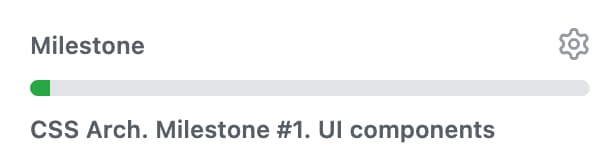
This way, we can see how we’re driving towards the goal, check how many issues were merged per week, and if needed, bring it up as a topic in our weekly sync to understand why we might be getting behind.
As this is the first time we are undertaking such big refactoring, the time part of the milestone is flexible. It is set to four weeks for this particular one, but as the amount of product work fluctuates, this deadline needs to be flexible too.
Visual regression tests
When refactoring the entire CSS of an app, the risk of introducing visual regression bugs is pretty high. To help us catch these bugs early and provide some support when reviewing Tailwind-related PRs, we have set up Percy, and more specifically, Percy in Storybook.
For our first milestone, we’ve updated our UI component’s stories to generate a base snapshot so, as we convert our styles to Tailwind, if we do miss something and introduce regressions, it will fail our Percy tests.
Adding Percy does not completely remove the need to check changes manually, but we are hoping it can provide some support and speed up reviews.
Technical difficulties and their solutions
Before kicking off the initiative, we had a lot of questions to answer. Converting our codebase to Tailwind is unfortunately not as straight forward as replacing a class with a set of Tailwind classes.
Over time, our global CSS got pretty untangled so we started by identifying our current blockers, and thinking about the different scenarios where we needed more robust solutions.
Here are some examples:
Readability
Tailwind classes can end up pretty long and make your code a bit less readable:
<div class="tw-sr-only focus:tw-not-sr-only tw-bg-teal-darker tw-text-white tw-block tw-rounded-sm tw-p-1 tw-mt-5"></div>We agreed on having a “five classes” rule where, if we happen to chain more than five utility classes, we extract them into a variable, format them to be more readable, and use a custom utility ctl to remove whitespaces and new lines when classes are appended into the DOM.
import ctl from "@netlify/classnames-template-literals";

const componentCN = ctl(`
  tw-sr-only
  focus:tw-not-sr-only
  tw-bg-teal-darker
  tw-text-white
  tw-block
  tw-rounded-sm
  tw-p-1
  tw-mt-5
`);

const Component = () => <div className={componentCN}></div>;

export default Component;
Dealing with visual variants
One of our concerns was around handling different variants of a component. For example, our Alert component has different styles based on the situation in which it is used. To combine standard styles and variants, we compose our class names using conditionals in template literals.
const AlertCN = ({ error, warning }) =>
  ctl(`
    tw-relative
    tw-flex
    ${error &&
    `
      tw-bg-red-lightest
      tw-text-red-darkest
    `}
    ${warning &&
    `
      tw-bg-red-lightest
      tw-text-red-darkest
    `}
    ...etc
`);

const Alert = props => {
  const { error, warning } = props;
  return <div className={AlertCN({ error, warning })}>...stuff</div>;
};
Depending on the amount and complexity of the variants, we are also considering extracting them into their own separate components.
Overrides
As we are gradually converting our CSS, we will sometimes come across a situation where we cannot remove parts of our global CSS because it is used in different components, but we will need to override some properties inside the component we are currently converting. To handle this situation, we are going to use the tailwind-important utility. It lets us prepend our classes with the ! character to apply !important.
For example, in the code sample below, if we imagine that our global CSS sets the width of the p tag to 100%, but in this particular case we need it to be auto for mobile, we would write it this way:
<p className="!tw-w-auto md:tw-w-full">Hello world</p>For this utility to work, you also need to add important in your tailwind.config.js file, for the property you want to target, here width.
alignItems: ['responsive', 'important'],
width: ['responsive', 'before', 'after', 'important']
Once we’ve refactored to remove the highly-specific styles that made this approach necessary in the first place, we’ll be able to remove the important utility altogether.
Layout components
As we refactor our ui components to Tailwind, we have a unique opportunity to ensure our components are truly reusable in any context. Styles that impact layout outside of the component will be abstracted out so that we can encourage better component encapsulation.
To do this, we built a simple component called <Outset> to handle margins between ui components, so we can start removing those styles from the components themselves:
<Outset top={4}>
  <Alert error />
</Outset>
The Outset wrapper creates a dynamic Tailwind class based on the top value passed in (like tw-mt-4), and then adds that class name to any children inside it.
We decided to limit margin values in Outset to a consistent vertical direction (top) and consistent horizontal direction (left), in order to support consistent vertical rhythm without risk of collapsing margins. It also means we’ll be able to safely remove components from the page without breaking any spacing in the layout!
Next steps
Our next step will be creating layout components for common page-level patterns. This should empower us to build composable and consistent page layouts without copying and pasting fragile JSX patterns around the codebase.
Stay tuned!


